There is no single official autism awareness color. Blue is the most widely recognized, while gold, red and rainbow infinity symbols are used by autistic-led and neurodiversity movements.
That surprises many people because blue looks official in April. You'll see it on buildings, shirts and ribbons, and it's easy to assume someone assigned it. Nobody did. Colors spread through campaigns, community choices and repetition, and different colors now send different messages. Once you understand that, choosing one becomes less about finding the correct shade and more about deciding what you want to say.
Table of Contents
- Autism Awareness Colors at a Glance
- How Blue and the Puzzle Piece Became Symbols
- Why Gold, Red and Rainbow Infinity Symbols Exist
- Choosing a Color for Your Purpose
- The Puzzle Piece Debate and How to Handle Disagreement
- Confirm Your Child's Color Preference Before You Choose
Autism Awareness Colors at a Glance
If you're asking what are the autism awareness colors, the shortest accurate answer is blue, gold, red and rainbow, plus two shapes you'll see alongside them, the older puzzle piece and the newer infinity loop. Blue leads mainstream public campaigns. Gold, red and rainbow infinity symbols are more closely tied to acceptance, autistic identity and neurodiversity.
None of these is a clinical marker, diagnostic code or measure of prevalence, severity or support needs. A color can't tell you anything medical about a child. It's a social signal, closer to a slogan than a label.
You'll recognize the signals in everyday places. A building lit blue on April 2 is usually marking broad awareness. A gold infinity badge on a social post usually points to acceptance and autistic identity. A rainbow infinity logo at an event usually signals neurodiversity across many diagnoses, not autism alone.
Autism awareness colors and symbols at a glance
| Symbol | Main message | Where you see it | Who typically uses it |
|---|---|---|---|
| Blue | Broad public awareness and recognition | Light It Up Blue campaigns, April 2 events, buildings and ribbons | Mainstream awareness campaigns |
| Puzzle piece | Original 1963 emblem; now widely criticized | Older charity materials and ribbons | Declining use; many autistic advocates reject it |
| Gold infinity | Autism identity and value, linked to the chemical symbol Au | Acceptance posts and Light It Up Gold messaging | Autistic-led acceptance groups |
| Red | Solidarity, acceptance and action, as an alternative to blue | #RedInstead posts and advocacy materials | Advocacy groups seeking an alternative to blue |
| Rainbow infinity | Neurodiversity and variation across many profiles | Neurodiversity events, pride-style materials | Neurodiversity movement and broader neurodivergent communities |
If you only needed names, you can stop here. If you're choosing a color for a school, fundraiser or family post, the history and purpose behind each one will help you avoid sending a message you didn't intend.
How Blue and the Puzzle Piece Became Symbols
The first widely known autism emblem was a puzzle piece. A design associated with the National Autistic Society in the United Kingdom showed a child inside a puzzle shape, presenting autism as a mystery waiting to be solved. The image spread because it was easy to reproduce: one simple shape worked on ribbons, letterheads and charity materials, and blue often appeared alongside it.
Nothing about that early pairing was inevitable, though. What fixed blue in the public mind came later, and it came through the calendar.
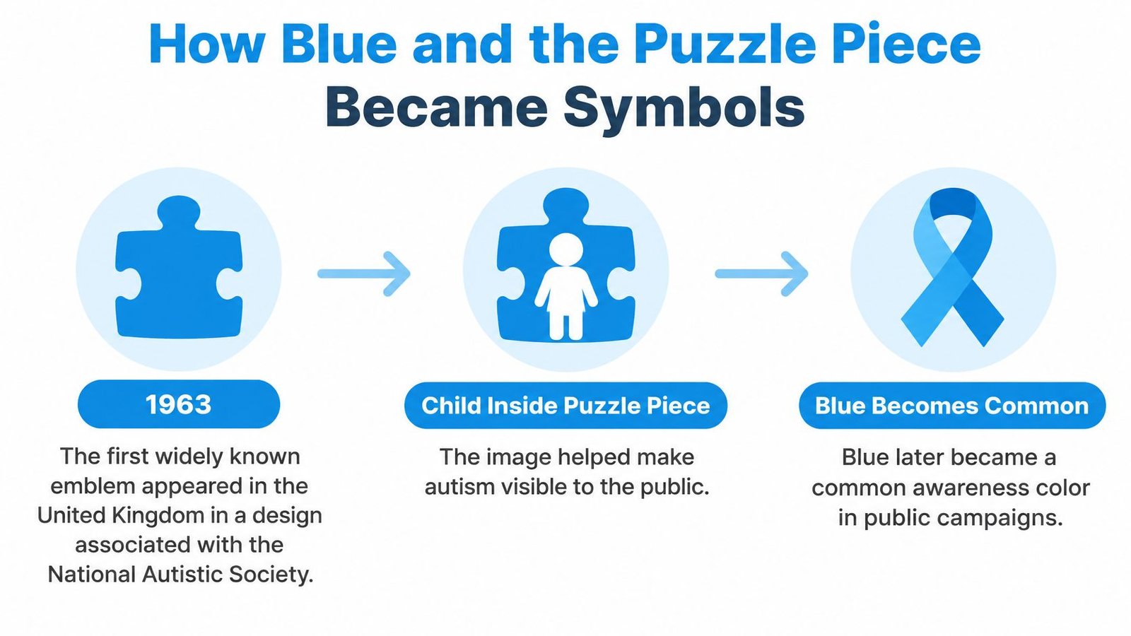
Blue rose through a sequence of public observances rather than a single decision. According to the Calendarr history of Autism Awareness Month, the Autism Society began observing an autism-awareness month in April 1970, then launched Autism Awareness Week in 1972, which later grew into a month-long observance. April 2 was subsequently established as World Autism Awareness Day, and the Light It Up Blue campaign launched in 2010, asking buildings, homes and communities to switch to blue lighting.
Each step made the next one easier, the way a footpath forms where enough people keep walking the same route. A month gave organizers a season to plan around. A fixed day gave landmarks one date for coordinated lighting. A named lighting campaign handed families and towns a single action anyone could copy. Repeat that every April, and blue becomes the color people recognize fastest.
Key dates in autism awareness color history
| Date | Event | Symbol link |
|---|---|---|
| Early charity era, before the blue campaigns | Puzzle-piece emblem appears in the UK, linked to the National Autistic Society | Puzzle piece |
| April 1970 | Autism Society begins observing an autism-awareness month | Blue |
| 1972 | Autism Awareness Week launched, later becoming a month-long observance | Blue |
| April 2 | Established as World Autism Awareness Day | Blue events and landmark lighting |
| 2010 | Light It Up Blue campaign launches | Blue lighting of buildings, homes and communities |
Two useful lessons sit inside that history. First, blue is a campaign color, built by dates and shared rituals rather than any official decision. A blue display signals participation in a public awareness tradition, not agreement with every idea attached to that tradition over the years. Second, a symbol's origin shapes the message it sends. The puzzle piece began as a picture of a child inside a mystery, and that framing is why many autistic people now read it very differently from a simple awareness ribbon. When you pick a symbol, you are also picking which story it carries.
Why Gold, Red and Rainbow Infinity Symbols Exist
Newer symbols answer a different question. Blue campaigns mainly asked the public to notice autism. Many autistic people wanted symbols that asked the public to accept, include and respect them. That shift gained momentum in the 2010s, when autistic-led groups favored infinity imagery over the puzzle piece.
This photo captures the community-facing side of that acceptance work.
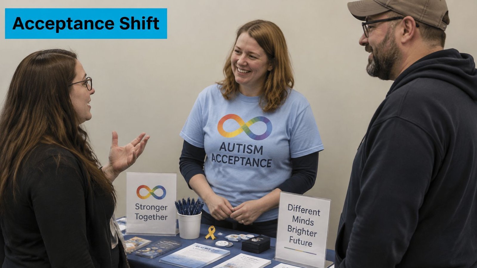
Gold starts with wordplay. The Raising Brilliance guide to autism colors and symbols explains that the chemical symbol for gold is Au, matching the first two letters of autism and autistic. A gold infinity therefore links identity with value and infinite variation, instead of suggesting something incomplete or needing to be solved.
Red works differently. It's tied to #RedInstead, a direct alternative to blue that stresses solidarity, acceptance and action. When you see red in April, the wearer is often making a deliberate choice to step away from blue-centered messaging while still showing support publicly.
The rainbow infinity is broader still. It represents neurodiversity across diagnoses, while gold infinity is more autism-specific. The loop suggests continuing development and variation among minds, rather than one standard type with pieces missing.
Two examples make decoding easier. A school flyer with a rainbow infinity logo is likely advertising neurodiversity programming for a mixed group of learners. A gold infinity badge on an acceptance post is more likely speaking specifically about autistic identity and pride. Context matters, including who created the material and what action it asks readers to take.
The video below adds first-person perspective to why those distinctions matter to families and peers.
No color is medically validated or universally preferred, and community views stay mixed even where one symbol is gaining ground.
Read each symbol as a clue to the creator's framing, not as proof of what every autistic person wants. That same respect for individual voice sits behind strong peer support for autistic children, where children learn from each other rather than from a single script.
Choosing a Color for Your Purpose
Pick the color that matches what you want people to do. Awareness and acceptance aren't interchangeable, and confusing them is the most common mistake families and schools make. Awareness asks people to recognize that autism exists. Acceptance implies concrete steps, such as sensory access, communication accommodations, inclusive education and respect for autistic autonomy. A color works like a headline: it sets expectations, and the words beneath it deliver the actual message.
Which color to lead with for each purpose
| Purpose | Color or symbol to lead with | Why it fits |
|---|---|---|
| Public education and awareness | Blue, with a label stating the campaign aim | Highest recognition during April and on April 2 |
| Acceptance and inclusion | Red or gold infinity | Signals acceptance and autistic-led messaging |
| Autistic pride and identity | Gold infinity | The Au wordplay ties the symbol directly to autism |
| Neurodiversity across diagnoses | Rainbow infinity | Covers many profiles rather than one autism type |
| Fundraising | Blue, with a plain statement of what donations fund | Recognition helps, and the statement prevents vague claims |
| Family support | The color the child chooses | Keeps the choice personal and documented for the care team |
Blue earned its recognition through repeated use on buildings, apparel and digital media around April 2, which makes it a high-recognition signaling convention. Use that recognition deliberately. Label whether your content promotes awareness, acceptance or practical support, because blue alone doesn't clarify your intent.
Say a school runs an April assembly for students who know little about autism. Blue with a clear awareness label and plain-language captions can work well, especially when staff continue the conversation through resources like autism training for teachers after the event ends. A parent group sharing a support resource might lead with gold infinity instead, because its aim is acceptance and identity rather than basic recognition. When the purpose is personal, the method is simpler: ask the child which color feels right, then write the answer down so teachers, therapists and relatives all see the same choice.
For fundraising apparel, design choices send the same signals at a glance, and practical fundraising shirt strategies from Cobra DTF can help you plan readable, durable prints for cause shirts. Pair any design with a plain statement of what donations fund. A recognizable color attracts attention, but transparency earns trust.
State your message in words: Don't expect a color to explain your purpose for you.
Consult autistic voices and local organizations before you print, especially for children and school communities. Use accessible visuals, strong contrast and plain-language captions. Avoid blue-only branding that implies one organization or viewpoint speaks for the whole community.
The Puzzle Piece Debate and How to Handle Disagreement
Many autistic adults criticize the puzzle piece directly. They say its history implies autistic people are mysterious, incomplete or problems to be solved. That's why the rainbow or gold infinity loop is now widely presented as an acceptance-oriented alternative focused on variation and inclusion.
The PA Autism guide to autism symbols notes that the puzzle piece is rejected by many autistic self-advocates for that implication, while blue remains recognizable in public awareness campaigns. Both facts can be true at once. A symbol can be familiar and still carry a message some people don't want attached to them.
This discussion image reflects the conversations families and teams often need before choosing shared language.
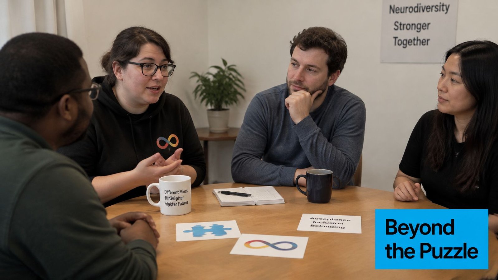
Fairness matters here. Some families and organizations still use puzzle-piece and blue materials because those items hold personal meaning or because their community recognizes them. Blue shouldn't automatically be called offensive. Depending on context, though, it can communicate a deficit-focused or organization-specific message, which is why understanding autism acceptance versus awareness helps before you defend or discard it.
Symbols are social signals
Symbols aren't neutral decoration. They tell other people whose perspective led the design. Avoid claiming that one symbol represents every autistic person, because preferences differ by person, family, culture and organization.
Guidance gets thinner for children who can't yet express a preference, multilingual families and mixed care teams. A practical step cuts through much of the conflict. Ask the child, using speech, AAC, drawing or choice boards, which colors and symbols feel comfortable.
- Offer two clear options: Place a blue card and a gold infinity card on a choice board and watch which one your child reaches for.
- Notice comfort, not just selection: Note relaxed or distressed responses when the symbol appears on clothing or school materials.
- Write the answer down: Share it with caregivers, therapists and teachers so everyone uses the same symbol and language.
That recorded preference turns a symbolic debate into person-centered communication. You're no longer arguing about what a color means in general. You're honoring what this child communicated.
Confirm Your Child's Color Preference Before You Choose
Settle the choice in a short, repeatable process. It protects your child from becoming a walking campaign for an idea they didn't choose, and it gives adults a shared answer when April materials arrive.
- Pick your purpose. Decide whether you need public education, acceptance, pride, neurodiversity, fundraising or family support, then choose the matching leading symbol.
- Offer a simple choice. Use speech, AAC, drawing or picture cards showing two or three realistic color options, not every symbol at once.
- Record the preference. Note the choice, the date, and when your child seems comfortable or distressed wearing or seeing it.
- Share the record. Give co-parents, therapists, teachers and school teams the same note, so shirts, flyers and posts stay consistent.
- Revisit as your child grows. Preferences change with age, friendships and self-understanding, so ask again rather than treating one answer as permanent.
Keeping that note where your whole team can find it matters more than picking a perfect color. Guiding Growth is an all-in-one mobile app for autism parents to track and improve behaviors, nutrition, health and sleep, and it helps parents identify triggers, analyze patterns and make informed decisions. Use it as a record-keeping aid alongside your care team, not as a source of medical advice, and check the site for current features and platforms.
The color is the signal other people see first. Your child's own documented preferences, routines and responses are the substance behind it, and that substance should lead every public choice you make.
When a symbol choice comes up for a shirt, school event or family post, you'll answer faster if your child's preference already lives beside their routines, triggers and progress notes. Visit Guiding Growth to keep that shared record in one organized place, spot patterns over time and walk into therapy, doctor and school meetings with clear information.