You're trying to record what happened during a sudden meltdown. One child needs help calming down, another family member is asking a question, and your phone is already full of notifications. You open the caregiving app, but the screen presents unfamiliar icons, several competing choices, and a form that expects details you can't recall. In that moment, a confusing interface isn't merely inconvenient. It can stop useful information from being recorded at all.
A user friendly interface helps people complete important tasks with less confusion, less memory effort, and fewer mistakes. For parents and caregivers of neurodivergent children, that means the app should support real life as it happens, not assume quiet surroundings, uninterrupted attention, or perfect recall.
Table of Contents
- Understanding the True Meaning of a User Friendly Interface
- Core Principles That Drive Intuitive Design
- Why Interface Clarity Matters for Neurodivergent Caregiving
- Designing for High-Stress and Cognitive Accessibility
- Real-World Features That Reduce Caregiver Burnout
- Measuring Success with Actionable UX Metrics
- Building a Supportive Digital Environment
Understanding the True Meaning of a User Friendly Interface
A visually attractive app can still be difficult to use. Soft colors, polished illustrations, and smooth animations don't help if a parent can't tell what to tap next or whether an important note was saved. User-friendliness is about the quality of the interaction, especially when the user is tired, distracted, or under pressure.
Jakob Nielsen's usability heuristics, first consolidated in 1994, remain a foundational reference because they were developed through factor analysis of a much larger set of usability principles and selected for their explanatory power across real development problems. The resulting 10 heuristics give product teams a practical vocabulary for interfaces that are easier to learn, move through, and recover from errors. Nielsen's framework includes visibility of system status, a match between the system and the actual world, user control and freedom, consistency and standards, error prevention, recognition rather than recall, flexibility and efficiency, aesthetic and minimalist design, error recovery, and help or documentation. Jakob Nielsen's history of usability heuristics explains why this framework remains influential.
What user-friendliness looks like during care
Suppose a parent logs a behavior event. A user friendly interface might show familiar language such as “What happened?” rather than an abstract label such as “Event classification.” It might offer visible choices for common situations, allow a quick note or voice entry, and confirm that the record has been saved. If the parent makes a mistake, an edit or undo option should be easy to find.
These details reflect Nielsen's principles in practical form:
- Visibility: The app shows whether the entry is saving, saved, or incomplete.
- Real-world language: Labels reflect the words families and care teams already use.
- Error prevention: Structured choices reduce accidental omissions.
- Recognition: The user sees available options instead of remembering hidden commands.
- Recovery: A mistaken entry can be corrected without starting over.
The same thinking applies when families compare apps for autism. A care tool should fit the user's environment, including one-handed use, interruptions, emotional stress, and changing responsibilities between parents, caregivers, and clinicians.
For broader guidance on touch targets, navigation, spacing, and other mobile UI design best practices, product teams can use mobile-specific principles as a practical companion to Nielsen's general framework. The central test is simple: Does the interface reduce the work required to complete the task, or does it make the user manage the interface first?
Core Principles That Drive Intuitive Design
A user friendly interface isn't a decorative layer added after the product works. It's part of the product's ability to help people complete tasks, return to the service, and trust the information they create inside it. Research collected by Higo Creative links poor experiences with lower retention and connects mobile readiness, speed, and clear design with business outcomes. For example, 88% of users are less likely to return after a bad experience, while 53% of mobile visitors leave a page that takes longer than 3 seconds to load, according to its cited UX statistics. Higo Creative's UX statistics provides the source for these figures.
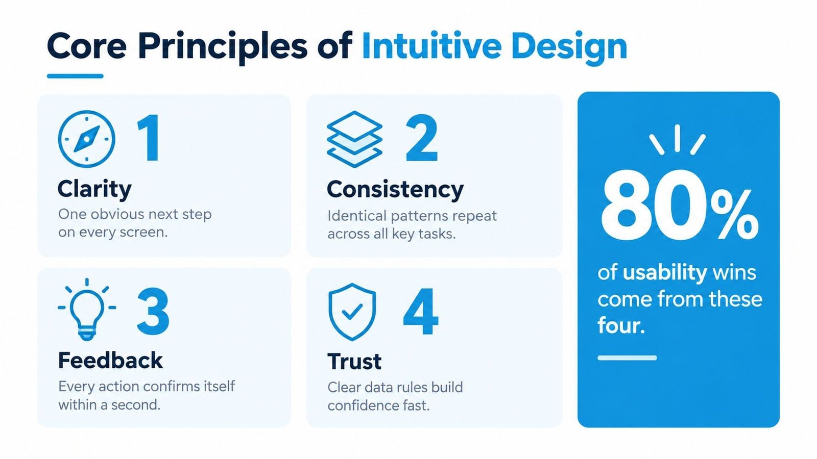
Clarity
Clarity answers one immediate question: What can I do here? A screen should make the primary action obvious, use familiar labels, and avoid presenting secondary actions with the same visual weight. In a caregiving app, “Log sleep” and “Add behavior note” communicate more clearly than unexplained symbols.
Consistency
Consistency lowers the need to relearn the product. If saving an entry uses one button style, the same pattern should appear for sleep, nutrition, medication, and appointments. Families move between tasks quickly, so repeated layouts and predictable controls help them recognize rather than recall how the app works.
Feedback
Every meaningful action needs a visible response. A confirmation message, changed button state, or saved timestamp tells the user that the system understood the request. Without feedback, people may tap repeatedly, abandon the task, or create duplicate records.
Trust
Trust grows when the product makes its behavior understandable. The same Higo Creative source reports that 67% of users are more likely to buy from a mobile-friendly company, and it cites potential conversion improvements of up to 400% for good user experience and 200% for strong UI design. It also presents the often-cited benchmark that every $1 invested in UX can return $100 in business value. These figures come from broad digital product research, not a caregiving-specific experiment, so teams should treat them as directional benchmarks rather than promises.
For care products, trust also means showing what happens to sensitive information, who can access shared notes, and how recommendations were produced. Simplicity earns attention, but transparent behavior earns confidence.
Why Interface Clarity Matters for Neurodivergent Caregiving
Caregiving often combines observation, decision-making, communication, and emotional regulation. A parent may be watching for a trigger while preparing food, answering a message from school, or helping a child transition between activities. The app competes with those demands, so every unnecessary choice adds pressure.
Cognitive load becomes especially important here. The cognitive load guidance for UX design explains that interfaces create extraneous mental effort when they force users to interpret clutter, remember navigation, or make unnecessary decisions. A caregiving app should remove that burden from high-frequency workflows instead of asking users to reconstruct events from memory.
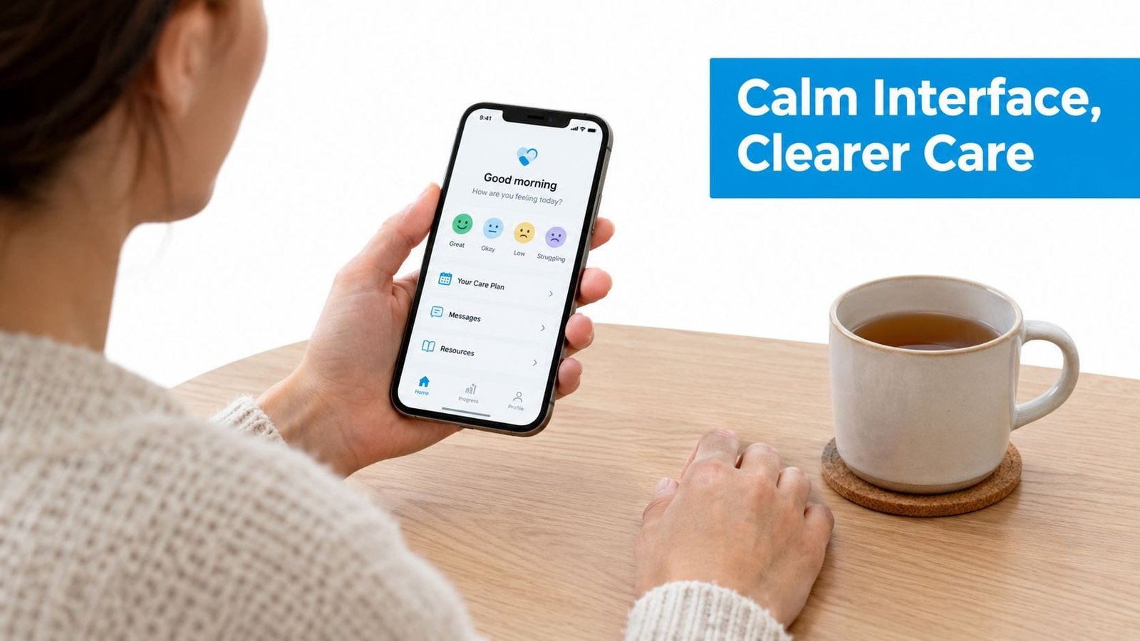
Offloading memory at the right moment
Consider two approaches to recording a behavior event. A generic form may ask the user to choose a category, enter a time, describe the context, select an intensity, and add an outcome before it allows the record to be saved. A care-focused flow can start with the most important fact, preserve the entry, and offer optional context afterward.
The second approach respects the reality of interrupted attention. It uses visible defaults, structured fields, reminders, and recent choices to reduce the amount the caregiver must remember. Clear labels and a strong visual hierarchy also help users distinguish essential information from optional detail.
Practical rule: Capture the event first. Invite reflection and additional context when the user has the capacity to provide it.
This principle applies to finding information, too. If a parent needs to locate a care note before an appointment, search and filtering should use recognizable terms. Notes about sleep, diet, routines, medications, or behavior shouldn't be buried behind a complex dashboard whose categories only make sense to the product team.
A helpful resource on ways to reduce brain fatigue with help can give families broader context about mental overload. In product design, the practical response is to shorten the path to common actions, preserve work automatically, and make the next step visible.
A user friendly interface doesn't assume the caregiver is careless when a log is incomplete. It assumes the environment is demanding and designs a forgiving path through it.
Designing for High-Stress and Cognitive Accessibility
Accessibility should describe what people can do in real conditions, not only whether a checklist has been completed. A care app can meet basic visual standards and still overwhelm a user with dense wording, unpredictable navigation, or too many choices at once.
U.S. Section 508 guidance recommends plain language, manageable sections, consistent layouts, recognizable icons with labels, clear action and error feedback, and customizable settings such as font size, themes, and interaction speed. Section 508 guidance for users with cognitive disabilities translates these principles into practical design expectations.
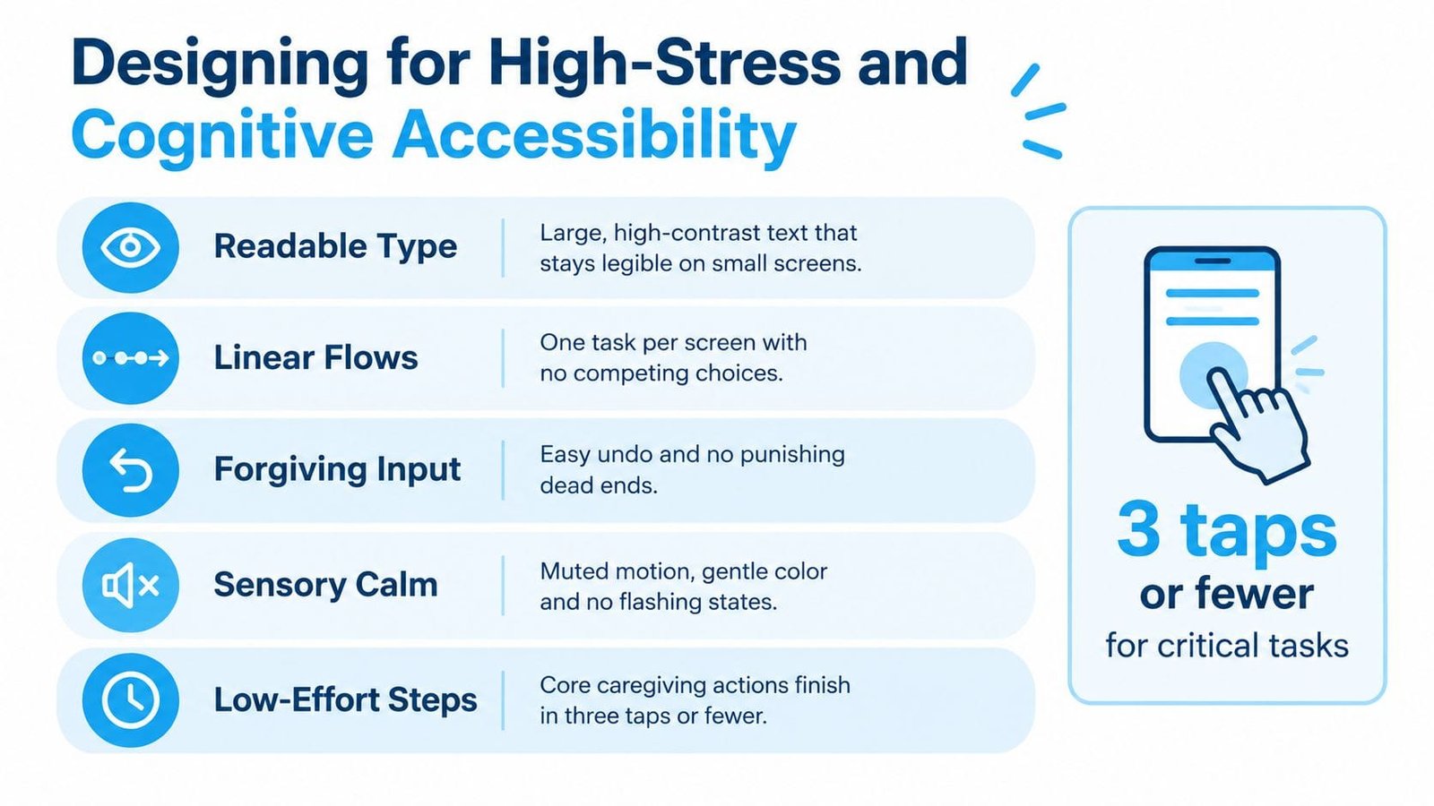
Five rules for lower-friction screens
Limit the main decision set. The W3C pattern for managing content quantity recommends providing five or fewer main choices on each screen and removing unnecessary content. W3C's manageable-quantity pattern offers a concrete way to reduce visual and cognitive overload.
Use plain, direct language. Avoid professional jargon when a familiar phrase works. “When did it start?” is easier to process than “Specify event onset.”
Show progress through multi-step tasks. MDN recommends logical steps, progress indicators, clear error messages, and recovery options in cognitively accessible interfaces. MDN's cognitive accessibility guidance provides implementation-oriented examples.
Support different ways of processing information. European Union guidance recommends short sentences and supporting materials such as charts, pictures, summaries, and videos. European cognitive accessibility guidance connects understandable content with more inclusive information design.
Make correction safe. Users should be able to undo, edit, and revisit an entry without losing the rest of their work. Error messages should explain what happened and what action will fix it.
Accessibility for AI needs more than a polished surface
AI-powered interfaces introduce another responsibility: trust calibration. Recent research describes trust as involving interface trust, behavior trust, and organizational trust, while research on generative-AI interfaces has found that avatars and other interface elements can affect how trustworthy a system feels. Research on trust in AI interfaces supports a broader view of trust than visual polish alone.
An AI companion should show what it's doing, explain why it offers a suggestion, distinguish observed information from generated guidance, and provide a visible way to correct or override it. Families shouldn't have to guess whether a recommendation came from their own records, a general response, or an automated interpretation.
Teams exploring ways to master cognitive load for focus should apply the same discipline to AI controls. Confidence cues, understandable explanations, and correction paths help users remain in control when the system's output influences care decisions.
Real-World Features That Reduce Caregiver Burnout
The difference between a general-purpose tracker and a caregiving tool appears in the moments each one supports. A general tracker may provide fields and charts, but it may not account for a parent recording information while managing a difficult transition. A specialized tool should reduce typing, preserve context, and make shared understanding easier.
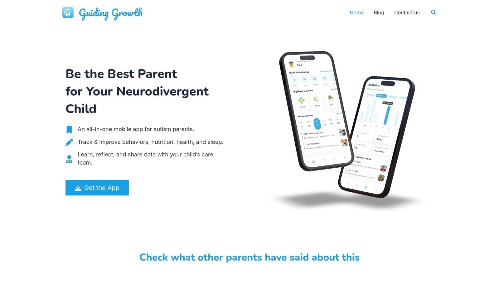
Guiding Growth is one example of a mobile app designed around these caregiving needs. It centralizes behavior logging for events such as meltdowns, shutdowns, demand avoidance, echolalia, and hand flapping, while allowing caregivers to record contextual triggers and outcomes. It also brings sleep, diet and nutrition, medications, doctor appointments, and therapy sessions into one place.
Voice logging is particularly relevant when typing is unrealistic. A parent can capture an observation without stopping to complete a long form, then return to add detail later if needed. This approach treats the caregiver's attention as limited rather than assuming every useful record can be created in a quiet sitting.
Generic tracking versus care-specific support
| General tracking pattern | Care-focused design choice |
|---|---|
| Manual typing for every entry | Quick voice logging for moments when hands and attention are occupied |
| Isolated categories | Connected context around behaviors, routines, triggers, and outcomes |
| Charts that require interpretation | Clear visualizations for reflection and pattern recognition |
| Private notes that stay in one person's device | Sharing and collaboration with family members, caregivers, and professionals |
| Opaque automated suggestions | AI features with understandable recommendations and visible user control |
Families can also use caregiver burnout prevention strategies alongside better tools and routines. The interface can't remove every pressure from caregiving, but it can prevent scattered notes, duplicated effort, and repeated explanations from consuming more energy than necessary.
The app includes Alma AI, an AI autism parenting companion, which adds another layer of interaction. That layer should be evaluated by the same trust standards described earlier. Parents need to understand what the assistant can do, what information it uses, and how to verify or correct its guidance.
A shared record becomes more useful when everyone involved can work from the same current information. Real-time collaboration can help parents, family members, in-home caregivers, therapists, pediatricians, allied health professionals, and school support staff stay aligned on needs and goals, provided the product makes permissions and data handling clear.
Measuring Success with Actionable UX Metrics
A team can't validate a user friendly interface by asking whether it looks clean. People often describe an interface as attractive during a review while still struggling to complete a task, missing an error message, or abandoning a form under pressure.
Testing should focus on realistic tasks. Ask a parent to record a behavior event, locate a previous note, review a sleep pattern, or share relevant information with another caregiver. Observe what happens when the task is interrupted, the user enters incomplete information, or the user needs to correct a mistake.
Metrics that reveal hidden friction
- Task completion: Record whether participants finish the intended action without assistance.
- Time to completion: Compare how long common workflows take, especially when users must act quickly.
- Error frequency: Track wrong selections, duplicate entries, missed fields, and navigation reversals.
- Recovery quality: Check whether users can understand and fix an error without losing their work.
- Cognitive burden: Ask what users had to remember, interpret, or decide during the task, then compare their answers with observed behavior.
- Accessibility performance: Test keyboard access where relevant, scalable text, contrast, labels, focus order, and screen reader behavior against WCAG-style criteria.
The goal isn't to pressure families to perform faster at any cost. Speed matters only when it reflects a clearer path and fewer unnecessary decisions. A short task that produces an incomplete or misunderstood record isn't a usability success.
Teams can also evaluate whether visualizations help families answer practical questions. Ways to visualize data should be judged by whether users can identify a pattern, compare relevant periods, and decide what to discuss with a care professional, not by chart complexity.
Testing should include people with different cognitive, visual, motor, and literacy needs. A design that works for a product manager in a quiet office may fail for a parent using one hand during a stressful routine. Realistic context turns subjective impressions into actionable evidence.
Building a Supportive Digital Environment
A user friendly interface for autism parenting apps should do more than make screens pleasant. It should help families notice, record, understand, and communicate without adding another source of confusion. That requires a combination of classic usability, cognitive accessibility, and carefully calibrated trust.
Nielsen's heuristics provide the foundation. They remind teams to communicate system status, use familiar concepts, prevent errors, maintain consistency, and support recovery. Cognitive accessibility adds the conditions that overloaded users need in practice, including plain language, manageable content, visible progress, adaptable presentation, and clear navigation.
Trust calibration extends the framework for AI-enabled products. Parents and professionals need to know what the system is doing, why it's offering a suggestion, what information supports that suggestion, and how to challenge it. A calm interface can support confidence, but confidence should come from understandable behavior, not appearance alone.
A practical standard for families and product teams
When evaluating a care app, ask:
- Can a caregiver record the essential event while distracted?
- Does the app use familiar words and recognizable controls?
- Can users find notes without remembering where they were stored?
- Does every important action provide clear confirmation?
- Can users correct mistakes without restarting?
- Are visualizations understandable without specialist training?
- Can families share information while retaining control over access?
- Does the AI explain its role and offer a clear correction path?
These questions shift the conversation from “Does the app look modern?” to “Does it help a real family make a reliable record during a difficult moment?” That's the standard that matters.
A purpose-built environment can reduce guesswork and replace scattered notes with structured information that families can review together. It can't solve every challenge in neurodivergent caregiving, but it can give parents a clearer way to recognize patterns, coordinate support, and prepare for conversations with professionals.
Guiding Growth brings behavior, sleep, nutrition, appointments, therapy details, collaboration, voice logging, and Alma AI into a mobile care environment designed for busy families. Visit Guiding Growth to explore how a user friendly interface can help you track daily experiences with less friction and share clearer information with the people supporting your child.