Your phone is probably full of half-finished notes about bedtime, food, meltdowns, stimming, and what happened right before everything changed. That kind of tracking feels messy in the moment, but it can become a clear picture when you use the best ways to visualize data for your child's real-life patterns. The goal isn't to make a chart look polished, it's to help you see what helps, what hurts, and what keeps repeating.
Parents of neurodivergent children often need more than a log. They need a way to notice whether sleep is getting steadier, whether a new school routine is easing stress, or whether certain transitions keep setting off hard mornings. Good visualization turns scattered observations into something you can use with therapists, teachers, and doctors.
Guiding Growth is built for that exact shift. It organizes daily care notes into visual patterns so families can track progress without rebuilding charts by hand. If your child's needs already touch sleep, diet, behavior, and routines, the right visuals can make those moving parts easier to understand.
Table of Contents
- 1. Line Charts and Trend Analysis
- 2. Heat Maps and Intensity Matrices
- 3. Scatter Plots and Correlation Discovery
- 4. Bar Charts and Categorical Comparisons
- 5. Pie Charts and Composition Breakdowns
- 6. Box Plots and Distribution Analysis
- 8. Stacked Area Charts and Cumulative Patterns
- 8. Stacked Area Charts and Cumulative Patterns
- 9. Radar Charts and Multi-Metric Skill Assessment
- 10. Timeline Visualizations and Sequential Event Mapping
- Top 10 Data Visualization Methods Compared
- Start Tracking and Visualizing with Confidence
1. Line Charts and Trend Analysis
Line charts work best when you want to see change over time. That makes them a strong fit for sleep duration, mood shifts, repeated meltdowns, or the gradual effect of a new routine. University of Hull's guidance places line graphs in the category of charts for change over time, alongside bar charts for category comparisons and scatter plots for relationships between two variables University of Hull chart guidance.
For parents, the value is simple. A week of rough evenings can feel like failure in the moment, but a line chart can show whether the pattern is drifting in a better direction after a therapy change or medication adjustment. That's much easier to discuss with a pediatrician than a wall of dated notes.
Practical rule: use line charts for a variable that moves across days, weeks, or months, not for one-off events. A single tantrum belongs in an event log, while repeated bedtime struggles belong on a line.
A strong workflow is to separate behaviors by color, then annotate major events like school breaks, travel, or a medication start. The NIH review on effective visualization says the chart should prioritize the information you want to share and show the data itself whenever possible, so the line needs to carry the story, not decorative styling NIH review. In Guiding Growth, that matters because daily logs can turn into an automatic trend view, which gives you a live picture instead of a manual spreadsheet project. For families who use the app's visual learner support, this kind of chart also helps explain patterns in a way that's easier to talk through at home and in care meetings Guiding Growth visual learner strategies.
2. Heat Maps and Intensity Matrices
Some patterns only show up when time meets context. Heat maps work well when you want to see whether mornings are consistently hard, whether certain days of the week are calmer, or whether a specific window, like after school, keeps turning red. They use color intensity to show where behavior clusters, which fits irregular real-world care logs well.
That matters for neurodivergent children because the day is rarely uniform. A child might be calm at lunch, overwhelmed at pickup, and settled again after dinner. A heat map makes that easier to spot at a glance, especially when you compare hours against weekdays, therapy days, or weather-related notes.
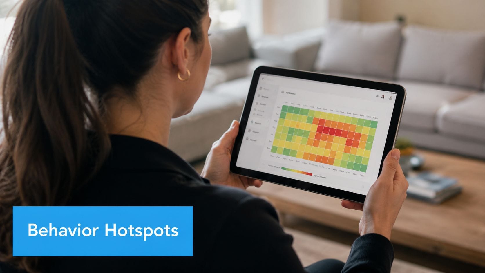
A useful way to read the chart is to look for repeated red zones rather than isolated spikes. If mornings are always difficult, that points to routine stress, sensory overload, or rushed transitions. If a rainy day plus unstructured time lines up with more demand avoidance, you have a clearer starting point for support planning.
Practical rule: add notes for context, not just numbers. A heat map without reminders about medication changes, sleep disruption, or schedule shifts can point families toward the wrong trigger.
Choose colorblind-friendly palettes like Viridis or Cividis, and keep numeric labels visible when precision matters. That combination helps in family meetings, because caregivers and clinicians may need to read the same pattern quickly. Guiding Growth's heat map view is built for that kind of comparison, so you can spot when a rough period is tied to a specific time block without recreating the chart yourself.
Scatter plots are the right choice when you need to compare two variables and see whether they move together. Learn more about when to use scatter plots, since they are useful for tracking things like sleep quality against screen time or focus against sensory input. They are not about proving cause and effect. They are about finding a signal worth checking.
That makes them useful for parenting because so many assumptions sound convincing until you plot the data. A child might seem more dysregulated after sugar, but the chart may show the issue is late bedtime. Or melatonin timing might line up with faster sleep onset on school nights but not weekends. The point is to test the pattern, not guess at it.
A good scatter plot needs consistency. Both variables should be logged over the same time span, and the context should stay visible. Weekend versus weekday markers, season changes, or therapy days can all change how you read the dots.
When you add a trend line, treat it as a guide, not a verdict. A correlation can point to a useful relationship, but it can also hide a third factor, like illness, travel, or a new classroom routine. That caution matters in child care, where multiple things often shift at once.
Practical rule: if a scatter plot suggests a pattern, check the dates beside the dots before you act on it. A cluster can look meaningful and still be driven by one disrupted week.
3. Scatter Plots and Correlation Discovery
Scatter plots are the right choice when you want to compare two variables and see whether they move together. University of Hull specifically points to scatterplots for correlations, which is exactly why they're so useful for tracking things like sleep quality against screen time or focus against sensory input University of Hull chart guidance. They're not about proving cause and effect. They're about finding a signal worth investigating.
That makes them valuable for parenting because so many assumptions sound convincing until you plot the data. A child might seem more dysregulated after sugar, but the chart may show the issue is late bedtime. Or melatonin timing might line up with faster sleep onset on school nights but not weekends. The point is to test the pattern, not guess at it.
A good scatter plot needs consistency. Both variables should be logged over the same time span, and the context should stay visible. Weekend versus weekday markers, season changes, or therapy days can all change how you read the dots.
When you add a trend line, treat it as a guide, not a verdict. A correlation can point to a useful relationship, but it can also hide a third factor, like illness, travel, or a new classroom routine. That caution matters in child care, where multiple things often shift at once.
Practical rule: if a scatter plot suggests a pattern, check the dates behind the points before acting on it. One surprising cluster can reflect a temporary event, not a stable truth.
Guiding Growth's correlation analysis is designed for exactly this kind of look-along pattern spotting. It helps surface possible links between logged behaviors and context, which is useful when you need a better starting hypothesis for home routines, therapy planning, or conversations with a clinician.
4. Bar Charts and Categorical Comparisons
Bar charts are the clearest choice when you're comparing categories. The statistical logic is straightforward, a single categorical variable is usually shown with a bar chart, while a single numerical variable is better shown with a histogram or box plot University of Hull chart guidance. For parents, that means bar charts are a natural fit for comparing meltdown counts across settings, therapy types, or support strategies.
They're especially useful when you need a quick answer to a practical question. Which environment led to fewer demand-avoidant episodes? Which therapist seemed to get better engagement? Which accommodation reduced hand-flapping most often? Those are category questions, and bar charts make them visible fast.
Ordering matters. A bar chart sorted from highest to lowest usually reveals the story faster than alphabetical order. If the labels are long, horizontal bars are easier to read than vertical ones. That's useful for real family logs where a category might say something as specific as demand avoidant episodes during homework.
Bar charts also help when you want to show progress in a single skill across different settings. A child might communicate more at home than at school, or engage more during structured therapy than during free play. Those differences can guide support decisions without needing a long explanation.
- Compare settings clearly: home, school, therapy, and community often deserve separate bars.
- Limit the clutter: too many categories make the chart harder to scan.
- Keep colors consistent: use the same color for the same behavior across reports so patterns stay easy to follow.
Guiding Growth turns behavior logs into these comparisons automatically, which saves parents from sorting every note by hand. That matters when you want to compare this week with last week, or one environment with another, and share the result with someone who needs a quick visual summary.
5. Pie Charts and Composition Breakdowns
Pie charts are useful when you want to show how a whole is divided into parts. They're not the right answer for every dataset, but they do work when the message is compositional, especially for a small number of categories. In a family setting, that might mean showing how a day breaks down between therapy, school, self-directed learning, and free play.
Their strength is immediacy. A parent can look at one slice and understand that more of the day is going to therapy, or that most of the child's challenges seem sensory-related rather than social. That said, pie charts become harder to read as the slice count grows, which is why they work best with a small number of categories.
The UK government's data visualization guide says a good chart should start with a title that gives an obvious description or takeaway, followed by a caption that explains the data source and formatting choices UK government visualisation guide. That advice fits pie charts especially well, because a clear title and caption help prevent readers from misreading small slices or unclear labels.
For family care, keep the chart simple. Use percentage labels, avoid too many categories, and switch to bars if the list gets long. If you need to compare more than a few parts, horizontal bars usually make the breakdown easier to understand.
Guiding Growth uses pie charts for quick snapshots, like how therapy time is distributed or how challenges split across sensory, social, and demand-avoidant patterns. That kind of view is handy when you need a fast summary for a caregiver handoff or a conversation with a therapist.
6. Box Plots and Distribution Analysis
Box plots are one of the best ways to understand consistency. They show the median, spread, quartiles, and outliers, which makes them ideal when you want to know whether a child's sleep, anxiety, or focus is becoming more predictable. A line chart can show direction, but a box plot shows stability.
That difference matters. A child might still sleep six to seven hours, but if the nights are swinging widely, the routine may not be settling yet. A tight box suggests a steadier pattern, while a wide box with outliers suggests more variability and possibly more hidden triggers.
Box plots are also useful when comparing environments. If anxiety scores are more clustered at home than at school, the school setting may be less predictable. If medication timing seems to narrow the spread of focus scores, that could be worth discussing with a clinician. The chart helps families see variation, not just averages.
Some outliers are problems. Others are clues. A holiday, an illness, or a schedule change can explain a spike that shouldn't be treated like the new normal.
That's why individual data points matter, especially when the sample is small. Domain knowledge still matters more than the chart alone. A visual can tell you that something stands out, but it can't tell you why without context from the caregiver.
Guiding Growth can generate box plot summaries that show whether behavior is getting more predictable over time. For parents, that's often more meaningful than a simple count, because stability itself is a win when daily life has been turbulent.
8. Stacked Area Charts and Cumulative Patterns
A parent may notice the overall week looks heavier, even when no single behavior seems alarming on its own. A stacked area chart helps show where that total comes from. It tracks how separate categories build into one combined pattern over time, which is useful when you want to understand both the full load and the mix inside it.
That matters in neurodivergent care because progress is often uneven across categories. A child may have fewer meltdowns, but more shutdowns. Or the total amount of stress may stay steady while transitions become a bigger share of the problem. A stacked chart makes those shifts visible without forcing families to rely on memory alone.
The value is in the composition. A family tracking behavior, sleep disruption, sensory overload, and school refusals can see whether the total burden is rising because one area keeps growing or because several smaller issues are building together. That is especially helpful in an app like Guiding Growth, where cumulative patterns from daily logs can be reviewed alongside the context that shaped them, including entries from the hours logging tool.
This chart also helps with intervention tracking. A new support at school may reduce one type of difficulty while another takes its place. A parent can see that change clearly instead of labeling the week as a failure. In practice, that kind of view helps families talk about partial progress with more accuracy, which is often closer to real life than a simple up-or-down line.
The chart works best when the layers stay consistent. Keep the same order across views, use colors that are easy to tell apart, and add a total line if the combined trend needs to stand out. Notes placed on the chart can connect a visible shift to a routine change, a therapy adjustment, or a difficult week at home.
- Use stacked area charts for composition over time: they show how behavior categories add up as the weeks pass.
- Keep the categories stable: changing the order makes the chart harder to read.
- Add context where needed: annotations help explain spikes, dips, or a new pattern in the total load.
Guiding Growth can present stacked area views that show how different parts of a child's day contribute to the bigger picture. That helps parents spot whether demand avoidance, sensory overwhelm, or sleep-related strain is taking up more space over time, which is often easier to act on than a single total score.
8. Stacked Area Charts and Cumulative Patterns
Stacked area charts show how parts of a total change over time. They're helpful when you want to know not just whether behavior is increasing or decreasing, but which kind of behavior is driving the shift. That makes them a strong fit for weekly or monthly care tracking where the overall load matters as much as the categories inside it.
For example, a child's total challenging moments might stay similar while the mix changes from shutdowns to demand avoidance. Or the overall stress picture might rise because one new trigger keeps appearing, while other problems settle down. A stacked area chart preserves both the whole and the parts, which is hard to get from a single line.
This works well for families because intervention effects are often mixed. A new school support might reduce one behavior while another takes its place. Without a stacked view, that shift can look like failure. With it, you can see the composition changing, which is often where progress lives.
The chart works best when categories are ordered consistently. Place the most important layer where it stays visible, use contrasting colors for nearby sections, and add a total line if you want the overall trend to stand out. Annotations help too, especially when a new routine or therapy change should be connected to a visible shift.
Practical rule: use stacked area charts for composition over time, not for exact comparisons between many similar categories. If readers need precise category-to-category comparison, bars are usually better.
Guiding Growth can build these charts from behavior logs so parents can see whether interventions are changing the composition of challenges or only moving the total number around. That distinction is useful in care meetings because it points to what kind of support is helping.
9. Radar Charts and Multi-Metric Skill Assessment
Radar charts are useful when you want a quick snapshot across several skill areas at once. That makes them a strong fit for developmental tracking that includes communication, social skills, motor skills, sensory processing, and self-regulation. Instead of forcing each area into a separate chart, radar charts let you see the profile as a whole.
That whole-picture view can be powerful for parents and professionals who are trying to balance priorities. A child may be strong in communication but need more support in regulation, or may show steady motor progress while sensory issues remain uneven. The chart helps those differences stand out together.
The main risk is confusion. Too many axes can make the shape hard to read, and uneven scales can distort the picture. Keep the axes on the same scale, and limit overlays to a small number of time points so the chart doesn't turn into a blur of polygons.
Radar charts are best when the metrics are meaningful and consistent. If one axis means “focus” and another means “independent play,” the labels need to be clear enough that every caregiver understands what they're comparing. Otherwise the chart looks more impressive than it is useful.
Guiding Growth's skill tracking features can generate radar charts that show where your child is growing and where support still matters. That's useful in therapy reviews because it gives you one visual that can carry both celebration and planning without forcing everything into a long paragraph.
10. Timeline Visualizations and Sequential Event Mapping
Timelines are the right choice when the order of events matters. Medication changes, therapy starts, school transitions, major life changes, and behavior shifts all make more sense when they're placed in sequence. A timeline gives those events narrative structure, which helps parents and clinicians see what happened first and what followed.
That sequence can be critical in neurodivergent care. If a school change happened before sleep got worse, that context matters. If a new support plan preceded calmer evenings, that also matters. A timeline doesn't prove causation, but it makes the order visible so you can ask better questions.
The best timelines include both positive and difficult events. A child's breakthrough deserves space next to hospital visits, family moves, or transitions to a new classroom. That balanced view keeps the record honest and helps people avoid reading progress too narrowly.
Use vertical timelines for a simple story, or horizontal ones when you want to compare categories across the same period. Color-coding can help, with medical, educational, environmental, and behavioral events each getting their own category. If you want to add numbers, only do it when the date and outcome are both clear.

Guiding Growth's event logging turns this into an organized timeline automatically, which is helpful when you're trying to connect medication changes, therapy starts, seasonal patterns, and behavior shifts without sorting every note manually. The app also supports behavior tracking across meltdowns, shutdowns, demand avoidance, and related patterns, so the sequence stays connected to the day-to-day reality of care Guiding Growth behavior tracking app.
Top 10 Data Visualization Methods Compared
| Visualization | 🔄 Complexity (implementation) | ⚡ Resources & efficiency | ⭐ Expected outcomes (quality) | 📊 Ideal use cases | 💡 Tips / Key advantages |
|---|---|---|---|---|---|
| Line Charts and Trend Analysis | Moderate, requires time-series setup and consistent logging | Low–Medium, lightweight to update, efficient for real-time dashboards | High ⭐⭐⭐, reveals long-term trends and intervention effects | Tracking sleep, mood, meltdown frequency over weeks/months | Use color-coded lines, overlay trend lines, annotate key events |
| Heat Maps and Intensity Matrices | Medium, needs matrix aggregation and binning | Medium, requires categorical/time coverage and thoughtful palette choices | High ⭐⭐⭐, quickly highlights temporal hotspots | Identifying peak times/days for meltdowns or anxiety | Use colorblind-friendly palettes, add numeric values in cells |
| Scatter Plots and Correlation Discovery | Moderate, need paired-variable collection and plotting | Medium, requires consistent paired data; regression optional | High ⭐⭐⭐, uncovers correlations and supports hypothesis testing | Testing relationships (screen time vs sleep, dose vs effect) | Collect simultaneous measures, note correlation ≠ causation |
| Bar Charts and Categorical Comparisons | Low, straightforward counts/aggregation | Low, fast to produce from frequency data | High ⭐⭐⭐, clear ranking across categories for easy interpretation | Comparing therapy types, behavior counts, before/after changes | Order categories by value, limit bars (8–10), use consistent colors |
| Pie Charts and Composition Breakdowns | Low, simple composition charting | Low, minimal data processing but limited precision | Medium ⭐⭐, good for quick proportional snapshots to general audiences | Showing time allocation or 2–5 category distributions | Limit to ≤5 slices, include percentages or use donut variant |
| Box Plots and Distribution Analysis | Moderate, requires quartile calculations and optional overlays | Medium, needs sufficient sample size for meaningful summaries | High ⭐⭐⭐, shows variability, skewness, and outliers clearly | Assessing consistency (sleep variability, behavior spread) | Show individual points when n<20; investigate outliers |
| Bubble Charts and Multi-Dimensional Analysis | High, three-variable mapping plus legends and sizing logic | Medium–High, larger sample sizes and careful sizing to avoid overlap | Medium–High ⭐⭐, reveals multi-factor interactions but harder to read | Visualizing 3-way relationships (anxiety × focus × screen time) | Use controlled bubble size ranges, clear legends, and color-coding |
| Stacked Area Charts and Cumulative Patterns | Medium, time-series composition with consistent categories | Medium, needs consistent categorization across time | High ⭐⭐⭐, shows total trend plus contributing components | Tracking total behavior burden and component shifts over time | Order categories consistently, add total line, limit categories (4–6) |
| Radar Charts and Multi-Metric Skill Assessment | Moderate, design axes and ensure uniform scaling | Low–Medium, requires standardized scoring across metrics | Medium ⭐⭐, good holistic snapshot but less precise per axis | Multi-domain skill profiles (IEP goals, skill balance) | Keep same scale on all axes, overlay 2–3 timepoints with transparency |
| Timeline Visualizations and Sequential Event Mapping | Low–Medium, event logging and annotation workflow | Low–Medium, curate key events and dates; efficient for narratives | High ⭐⭐⭐, clarifies sequence and timing effects of interventions | Documenting therapy/medication changes and life events | Color-code event types, include quantitative context and annotations |
Start Tracking and Visualizing with Confidence
You don't need a data science background to spot patterns in your child's life. You need the right chart for the right question, and a consistent way to capture the details that matter most. Once you do that, the noise in your notes starts turning into a story you can act on.
The most useful visual is the one that answers a real parenting question. Is sleep settling down? Are mornings harder than afternoons? Did a support change help, or did something else happen at the same time? Charts like line graphs, heat maps, scatter plots, bar charts, box plots, bubble charts, stacked area charts, radar charts, and timelines each answer a different version of that question, which is why the best way to visualize data is always tied to the decision you need to make.
That's also where simple design matters. The NIH guidance on effective visualization says to prioritize the information you want to share and show the data itself whenever possible, while Harvard Business School and Tableau recommend keeping dashboards focused and avoiding too many views at once NIH review, Tableau best practices. For families, that means a clear chart can do more than a crowded one, especially when you're trying to communicate with a therapist, teacher, or pediatrician who doesn't have time to dig through raw notes.
Guiding Growth is a practical option for turning those notes into charts without extra manual work. It centralizes behavior logging, context, and routines, then presents the results in visual summaries that are easier to share and review. If you're ready to stop guessing and start seeing patterns clearly, visit Guiding Growth and begin tracking the details that can help you support your child with more confidence.