Tired of Scattered Notes? See Your Child's World Clearly
If you're managing a pile of behavior notes, school emails, therapy summaries, medication reminders, and half-finished observations in your phone, you're not alone. Most parents don't struggle because they aren't paying attention. They struggle because the information lives in too many places, arrives in different formats, and becomes hard to interpret when you're already tired.
That's where visual learner strategies help. They aren't only for children in classrooms. They're often just as useful for parents who need to make sense of patterns quickly, especially when a child's sleep, sensory load, transitions, food, appointments, and emotional regulation all affect the same day. Educational guidance has long pushed visual materials because many summaries repeat that about 65% of learners are visual learners, even if that figure is best treated as a rule of thumb rather than a hard biological fact.
When you can see information instead of hunting through it, decisions get easier. A pattern that was invisible in text often becomes obvious in a chart, timeline, map, or dashboard. That's why this guide focuses on visual learner strategies built for parents, with each one tied to a practical way to organize daily care inside Guiding Growth.
Table of Contents
- 1. Color-Coded Behavior Tracking Systems
- 2. Timeline and Sequential Visualization
- 3. Heat Maps and Intensity Visualization
- 4. Infographics and Icon-Based Communication
- 5. Comparison Charts and Side-by-Side Analysis
- 6. Spatial and Environmental Mapping
- 7. Progress Dashboards and Multi-Metric Summaries
- 8. Video and Motion-Based Documentation
- 8-Point Comparison of Visual Learner Strategies
- From Data Overload to Confident Action
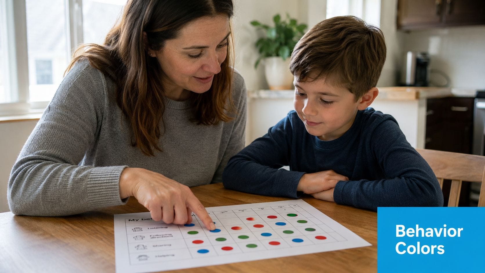
1. Color-Coded Behavior Tracking Systems
A good color system cuts review time fast. You shouldn't have to reread every note to remember whether an entry described a meltdown, a shutdown, a calm recovery period, or a positive social moment. Color lets your brain sort first and analyze second.
In practice, this works best when the categories reflect daily reality. Red, yellow, green can work, but many families need something more specific, such as one color for escalations, another for withdrawal, another for sensory discomfort, and another for successful regulation. In Guiding Growth, the benefit of a color-coded behavior view is simple: you can scan patterns across days without decoding paragraphs.
Pick Fewer Colors Than You Think You Need
Most parents start by over-labeling. They create a color for every mood, every trigger, every outcome, then stop using the system because it becomes one more thing to manage.
A tighter structure works better:
- Start with core categories: Pick three or four colors for the patterns you most need to see.
- Keep the same meaning everywhere: If blue means shutdown in the app, it should mean shutdown on printed notes and school handoffs too.
- Add a visible legend: Grandparents, sitters, therapists, and co-parents need the same visual key.
- Check accessibility: Some color combinations are hard to distinguish, especially under stress or for colorblind users.
Practical rule: If a caregiver can't understand your chart in ten seconds, simplify the colors.
I've seen families get the most value when they also color-code context, not just behavior. For example, they mark regulation supports in one tone and difficult transitions in another. That helps answer a better question than "What happened?" It answers "What tended to happen before things improved or worsened?"
This approach lines up with a long-running visual learning idea known as the picture superiority effect. One training summary notes that visuals can improve learning by up to 400% compared with text-only approaches, though that figure should be read cautiously as a broad training statistic. The practical takeaway is still useful for parents: flowcharts, diagrams, and color coding make complex relationships easier to recall than plain text alone.
2. Timeline and Sequential Visualization
When a hard day gets written as disconnected notes, it often looks random. A timeline puts events back into order. That matters because many challenging behaviors aren't isolated incidents. They're sequences.
A parent might log poor sleep, a rushed breakfast, a school transition, skipped sensory input, afternoon irritability, then a major escalation at dinner. Read separately, those entries feel unrelated. Viewed on a timeline, they tell a story.
Build a Day You Can Actually Read
The strongest timelines use a single horizontal flow with short entries, icons, and consistent timestamps. In Guiding Growth, a day-view timeline can help you line up behaviors with meals, medications, therapies, and routines so you can scan one day from morning to bedtime without jumping between screens.
That same logic makes task breakdowns easier too. If your child struggles with routines that have many small steps, a visual sequence can reveal where the breakdown usually begins. The handwashing task analysis guide from Guiding Growth is a good example of how sequential visuals reduce guesswork by turning a vague routine into visible steps.
A few details make timelines more useful:
- Log anchor events consistently: Meals, medication, sleep, appointments, and transitions should be entered the same way each day.
- Separate weekday and weekend patterns: Different routines often create different behavior chains.
- Annotate unusual conditions: Visitors, weather changes, late pickups, and poor sleep can explain a lot.
A timeline doesn't prove causation. It helps you spot the sequence worth discussing with your care team.
This is one of the most practical visual learner strategies for parents because it lowers the mental load of memory reconstruction. You don't have to ask, "What happened first?" The order is already there, which makes school meetings, therapy reviews, and pediatric appointments more focused.
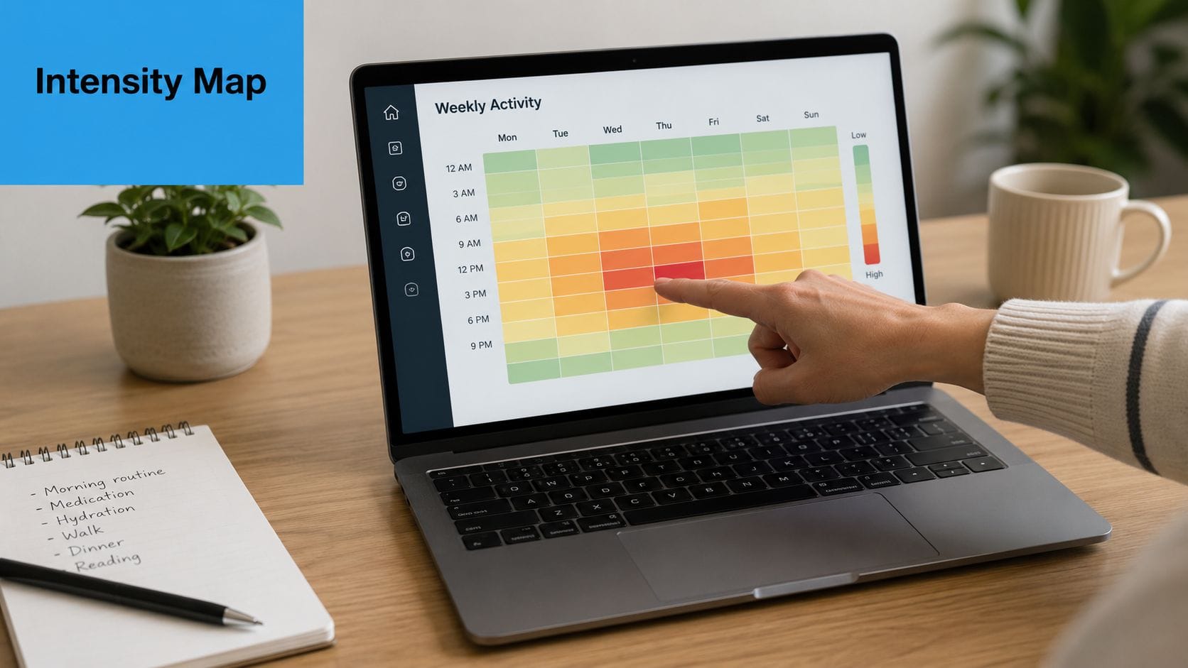
3. Heat Maps and Intensity Visualization
Some patterns only show up when repetition becomes visible. Heat maps do that well. Instead of reading ten separate entries about rough mornings or hard transitions after school, you see concentrated blocks of higher intensity across the week.
That kind of visual helps parents avoid two common mistakes. The first is underestimating frequency because each incident feels isolated. The second is overreacting to one hard day when the broader pattern is milder than it felt in the moment.
Find the Hot Spots Without Overreacting
A useful heat map answers a narrow question. It might show when meltdowns cluster by time of day, which nights involve the most sleep disruption, or which school-day transitions create repeated stress. In Guiding Growth, an intensity-style weekly view can help surface those "hot spots" without making you dig through raw logs.
Keep the setup restrained:
- Use a small color range: Three to five gradations are usually enough.
- Track one behavior category at a time: Mixed categories can muddy the picture.
- Review before and after a change: If you adjust sleep routines, sensory supports, or medication timing, compare the pattern visually.
- Pair visual intensity with notes: Heat maps show concentration, but short notes explain context.
A real-world example is the child who seems to have "random" after-school meltdowns. Once the family maps intensity by hour, they may notice the most difficult periods follow bus rides, hunger, and unstructured transition time. The response isn't just more discipline or more prompting. It may be a snack ready at pickup, quieter decompression time, and fewer demands for the first part of the afternoon.
Used well, heat maps are one of the clearest visual learner strategies because they turn emotional impressions into visible clusters. Parents stop relying only on the day they remember most vividly.
4. Infographics and Icon-Based Communication
When everyone supporting a child uses different language, communication slows down. One caregiver writes "stimming increased." Another writes "more hand flapping." A teacher notes "repetitive movement during transition." An icon system brings those observations closer together.
That's why icon-based tracking works so well. It gives families a shared shorthand. A single symbol for echolalia, sensory overload, refusal, successful transition, or independent completion can reduce writing and improve consistency across caregivers.
Use Symbols That Everyone Understands
The icons have to be obvious enough to work under pressure. If someone has to stop and think about what a symbol means, it isn't doing its job. In Guiding Growth, icon-based behavior logging helps parents record common patterns quickly, especially when typing long notes isn't realistic.
The same principle shows up in visual storytelling. A short social narrative with pictures often lands better than a text-heavy explanation, particularly for children who process routines, expectations, or emotions more clearly through images. The Guiding Growth article on writing social stories fits naturally here because it applies the same visual logic to communication, not just tracking.
A few habits make icon systems stronger:
- Pair icons with brief text labels: Especially at the start.
- Keep style consistent: Don't mix cartoon icons, realistic photos, and abstract symbols randomly.
- Test symbols with your child and your team: Recognition matters more than design taste.
- Create one family reference sheet: Everyone should use the same meanings.
One caution: Icons simplify communication, but they can oversimplify behavior if you stop at the symbol and skip the context.
For families who also want more visual creativity in daily supports, fostering creativity with Ocodile can spark ideas for making home visuals more engaging without turning every support into a formal therapy tool.
5. Comparison Charts and Side-by-Side Analysis
Some of the best decisions in care happen when you compare two periods with integrity. Not perfectly. Genuinely. A side-by-side chart can show whether a new bedtime routine helped, whether school accommodations changed afternoon behavior, or whether a medication shift lined up with different sleep or appetite patterns.
Parents often make the mistake of comparing feelings instead of comparable windows. "This month feels worse" isn't useless, but it isn't enough. A simple chart that compares similar time blocks is usually more reliable than memory.
Compare Like With Like
The strongest comparison charts hold one variable steady as much as possible. Compare school weeks to school weeks. Compare weekends to weekends. Compare the same behavior definitions before and after an intervention. In Guiding Growth, before-and-after visual summaries can help families review change without manually rebuilding charts every time a routine shifts.
What works well:
- Use equivalent periods: Don't compare a holiday week to a regular school week and expect clean insight.
- Define the target behavior first: Everyone should know what counts.
- Write the intervention directly on the chart: "Added visual bedtime routine" is more useful than trying to remember later.
- Bring the chart to appointments: It keeps conversations grounded.
The trade-off is important. Comparison charts can create false confidence if too many things changed at once. A family might see improvement after starting a supplement, but the same week also included a school break, reduced demands, and better sleep. The chart still helps. It just shouldn't carry more certainty than the data can support.
This is one of the most practical visual learner strategies for parent advocacy. A clean comparison helps you communicate with teachers, physicians, and therapists without sounding like you're making a vague impression-based argument.
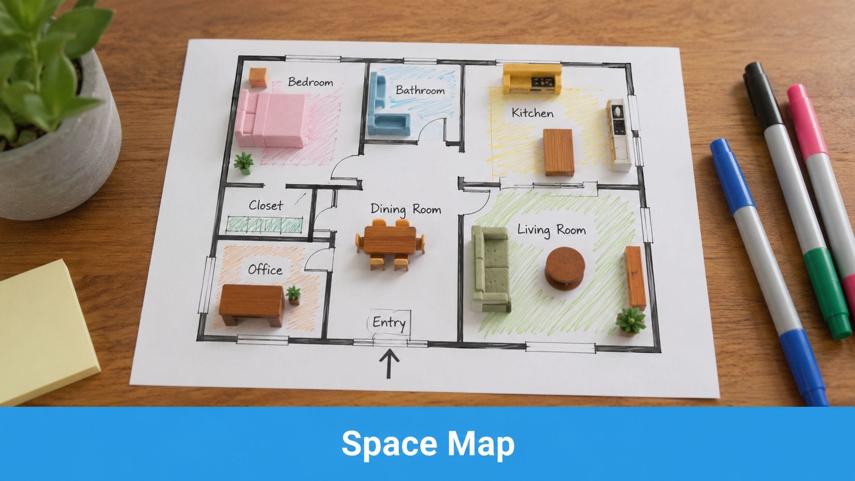
6. Spatial and Environmental Mapping
Some behaviors belong to places. A child may regulate well in one room and unravel in another. If you only track what happened and not where it happened, you can miss a major trigger.
Spatial mapping is useful when the environment itself may be part of the problem. That could mean bright kitchen lighting, a noisy hallway, a crowded waiting room, a chaotic classroom entry, or even the route between two spaces.
Map the Room, Not Just the Behavior
You don't need architectural software to do this. A rough sketch of the home, classroom, clinic, or public space often reveals enough. In Guiding Growth, location-based logging can help parents notice whether meltdowns cluster in specific rooms, community settings, or transitions between environments.
A useful map includes more than walls and furniture. It should mark sensory features too:
- Noise sources: TV, blender, hallway traffic, hand dryer, cafeteria line.
- Lighting issues: Fluorescent glare, direct sun, dim corners.
- Touch and crowding factors: Tight entry points, scratchy seating, long lines.
- Safe spots: Retreat spaces, calming corners, low-demand zones.
I've seen this work especially well when families prepare for recurring problem settings. A parent might map a grocery store trip and realize the hardest point isn't the store overall. It's the checkout area, where waiting, fluorescent lights, and noise stack up at the end of an already hard task.
If you want a cleaner visual layout for home planning, create stunning home designs with RoomSketch3D can help you sketch spaces and test arrangement ideas before moving furniture or changing a room setup.
7. Progress Dashboards and Multi-Metric Summaries
Parents rarely need more data. They need one place where the right data sits together. A dashboard does that. Instead of checking separate notes for sleep, behavior, medication, food, routines, and appointments, you get a visual summary of how those pieces are moving together.
That kind of summary matters because care decisions usually don't rest on one metric. A hard week in behavior may make more sense once you also notice poor sleep, missed routines, or heavy appointment load.
Keep the Dashboard Narrow Enough to Help
A dashboard becomes clutter the moment it tries to show everything. Start with the handful of measures that change decisions in your family. In Guiding Growth, a home dashboard can bring behavior logging, routines, medications, appointments, and progress indicators into one view so the big picture is easier to read.
Useful dashboard design usually follows a simple rule set:
- Prioritize decision-making metrics: Include what changes care, not what merely exists.
- Use stable visual hierarchy: The most urgent items should stand out first.
- Keep labels plain: "Sleep disrupted" beats vague wording.
- Review it before appointments: A dashboard snapshot often leads to better questions.
For families trying to make therapy data more understandable, the Guiding Growth guide on tracking autism therapy progress complements this approach well. It turns abstract progress talk into visible, reviewable information.
A dashboard should reduce decision fatigue. If it makes you feel behind every time you open it, it needs fewer metrics or better organization.
Among visual learner strategies, dashboards are the closest thing to a command center. They don't replace clinical judgment. They make it easier to bring your observations into the room in a format other people can follow.
8. Video and Motion-Based Documentation
Some patterns are too fast, too subtle, or too context-dependent for text alone. A written note can say "escalated after demand was placed," but video can show body language, pacing, sensory cues, distance from others, tone of voice, and the exact moment a regulation strategy started working.
That's why selective video documentation can help. Not constant recording. Selective recording.
Record for Context, Not Surveillance
Good video use starts with a narrow purpose. You might capture one recurring transition, one feeding difficulty, one self-regulation challenge, or one calming strategy that works and should be replicated. In Guiding Growth, voice logging can help preserve context quickly, and families who choose to record clips can pair observations with notes rather than relying on memory alone.
A few boundaries matter:
- Get consent where required: Especially in schools, clinics, and shared spaces.
- Capture before and after when possible: The lead-up and recovery often matter more than the peak.
- Annotate briefly: Mark trigger, response, and calming strategy.
- Share narrowly: Only with caregivers or clinicians who need it.
One of the best uses is showing success, not just crisis. A short video of a child calming with specific sensory support, movement, pacing, or visual prompts can be more useful than a long clip of distress. It gives the team something concrete to repeat.
For readers curious about how motion-based tools are evolving more broadly, Veo3 AI video generation shows another side of how visual media can be created and interpreted, though in care settings the priority should always be privacy, consent, and practical documentation.
8-Point Comparison of Visual Learner Strategies
| Strategy | Implementation complexity 🔄 | Resource requirements ⚡ | Expected outcomes ⭐📊 | Ideal use cases 💡 | Key advantages ⭐ |
|---|---|---|---|---|---|
| Color-Coded Behavior Tracking Systems | Low 🔄, simple setup, needs family agreement | Low ⚡, stickers/apps, minimal training | Faster scanning and pattern recognition ⭐⭐⭐ 📊 | Daily logging, caregiver communication, quick clinic updates | Instant visual cues; low literacy barrier ⭐ |
| Timeline and Sequential Visualization | Medium 🔄, consistent timestamped entries required | Medium ⚡, app timeline, annotations | Reveals trigger→behavior chains; aids planning ⭐⭐⭐⭐ 📊 | Medication timing, cause-effect analysis, therapy planning | Chronological context for interventions ⭐⭐ |
| Heat Maps and Intensity Visualization | Medium–High 🔄, aggregation and calibration needed | Medium ⚡, weeks of data, visualization tools | Identifies hotspots and peak periods ⭐⭐⭐⭐ 📊 | Spotting time/day clusters, proactive scheduling | At-a-glance intensity patterns for targeting ⭐⭐ |
| Infographics and Icon-Based Communication | Low–Medium 🔄, design and testing for clarity | Low ⚡, icon libraries, basic design work | Faster comprehension and broader accessibility ⭐⭐⭐ 📊 | Non-verbal communication, visual schedules, family guides | Reduces cognitive load; consistent symbols ⭐ |
| Comparison Charts and Side-by-Side Analysis | Medium 🔄, requires equivalent baselines and metrics | Medium ⚡, collected baseline data, charting tools | Demonstrates intervention impact and trends ⭐⭐⭐⭐ 📊 | Before/after studies, home vs. school comparisons | Concrete evidence for treatment decisions ⭐⭐ |
| Spatial and Environmental Mapping | Medium 🔄, mapping spaces and annotating sensory features | Medium ⚡, floor plans/photos, simple mapping tools | Reveals location-based triggers; guides modifications ⭐⭐⭐ 📊 | Sensory assessments, classroom/home layout planning | Targeted environmental change recommendations ⭐ |
| Progress Dashboards and Multi-Metric Summaries | Medium–High 🔄, integration and customization effort | High ⚡, multiple data streams, ongoing entry | Holistic view; prioritizes areas needing action ⭐⭐⭐⭐ 📊 | Complex care management, multidisciplinary reviews | Comprehensive snapshot; reduces navigation time ⭐⭐ |
| Video and Motion-Based Documentation | High 🔄, recording, consent, and analysis protocols | High ⚡, devices, secure storage, review time | Rich contextual evidence; precise functional assessment ⭐⭐⭐⭐📊 | Functional behavior assessments, clinician coaching | Objective, detailed records; strong clinical evidence ⭐⭐ |
From Data Overload to Confident Action
Most parents don't need to become analysts. They need systems that help them see what they're already living. That's the main strength of visual learner strategies. They reduce the friction between observation and action.
Color coding helps you sort behavior patterns fast. Timelines show sequence. Heat maps reveal concentration. Icons make communication faster across caregivers. Comparison charts keep interventions honest. Spatial maps uncover environmental triggers. Dashboards bring the whole picture together. Video preserves details that written notes can miss. None of these tools works because they're flashy. They work because they help you notice relationships that text alone tends to hide.
There are trade-offs. Visual systems can become too complex. They can create false certainty if the underlying data is inconsistent. They can also become another abandoned tool if they require too much setup. The answer isn't to track everything. It's to track what helps you make better next decisions.
For most families, that means choosing one or two visual learner strategies first. Start where your stress is highest. If mornings are chaotic, build a timeline. If incidents feel random, try a heat map. If multiple caregivers keep describing the same behavior differently, use icons and color categories. If appointments feel rushed, create a dashboard or comparison chart before the visit.
This is also where an app can help, because the system only works if you can keep using it on ordinary days. Guiding Growth is one option designed around that practical need. It brings behavior logging, routines, sleep, nutrition, medications, appointments, and visual summaries into one mobile workflow so parents don't have to build every chart from scratch. It also supports visual schedules, which can help families turn planning into something a child and caregiver can both follow more easily.
The larger shift is emotional as much as logistical. When your notes become visible patterns, you stop second-guessing every memory. You can walk into a school meeting or therapy session with something clearer than "I know something is off." You can say, "This pattern shows up here, at this time, after this kind of transition, and this support seems to help."
That's what confident action looks like. Not perfect data. Clearer data, used consistently enough to support your child with less guesswork and more alignment.
If you're tired of piecing together screenshots, notebooks, and mental notes, Guiding Growth gives you a practical place to log daily life, see patterns visually, and share clearer information with the people supporting your child.