You're probably here because you searched for symbols for autism and found a mess of mixed messages.
One website shows a puzzle piece. Another uses a rainbow infinity loop. A school handout uses blue. An autistic adult you follow online says blue and puzzle pieces feel upsetting. You want to be respectful, but you also don't want to make a public mistake with something as personal as your child's identity.
That confusion is understandable. Autism symbols aren't just decorations. They carry ideas about what autism is, how society sees autistic people, and what kind of support families should build around a child. Some symbols come from a view of autism as a problem to solve. Others come from a view of autism as a natural part of human diversity.
For parents, this can feel surprisingly emotional. The symbol you put on a backpack tag, classroom binder, therapy folder, or family T-shirt can communicate your caregiving philosophy. Are you saying, “My child needs to be fixed”? Or are you saying, “My child deserves understanding, accommodations, and respect exactly as they are”?
Table of Contents
- Why Autism Symbols Cause So Much Confusion
- The Puzzle Piece Symbol's Controversial History
- The Rise of the Neurodiversity Infinity Symbol
- Comparing Autism Symbols Head to Head
- Beyond the Main Symbols Colors and Icons
- How to Use Symbols in Daily Life and Communication
- Conclusion Choosing Acceptance and Understanding
Why Autism Symbols Cause So Much Confusion
A parent often first notices this issue during an ordinary task. You might be ordering school supplies, looking for an autism acceptance shirt for April, or making a communication binder for your child. Then the question hits: which symbol is respectful?
Part of the confusion comes from the fact that different groups use different symbols for different reasons. Some families learned about autism through older awareness materials and still recognize the puzzle piece first. Many autistic adults, though, prefer the infinity loop. A cross-cultural survey on autism language and symbol preferences found that autistic individuals predominantly prefer the infinity loop symbol, while parents and professionals often favor the puzzle ribbon, reflecting a clash between identity-affirming neurodiversity views and traditional medicalized perspectives.
That difference matters. It tells you this isn't only a design choice. It's a values choice.
Why parents get mixed signals
Parents usually hear from several communities at once:
- Schools and clinics may use familiar awareness imagery because it has been around for a long time.
- Autistic self-advocates often prefer symbols that reflect dignity, identity, and acceptance.
- Extended family members may not know there's any debate at all.
- Online shops and social media pages frequently mix symbols without context.
Practical rule: If a symbol is widely recognized but regularly rejected by autistic people, it's worth pausing before you use it.
Another reason this feels hard is that parents are rarely trying to make a statement. Most are trying to help. But even caring parents can inherit language and imagery built around older assumptions. If you've ever felt caught between “awareness” messaging and “acceptance” messaging, this deeper look at autism acceptance vs awareness can help clarify why the difference feels so significant.
The deeper question behind the symbol
The question isn't “Which logo is correct?” It's “What story does this symbol tell about my child?”
If the story is that autism is a mystery, a defect, or a missing piece, that shapes how people respond. If the story is that your child has a distinct way of thinking, feeling, communicating, and sensing the world, that opens the door to more respectful support.
The Puzzle Piece Symbol's Controversial History
The puzzle piece is still one of the most recognizable symbols for autism. That familiarity can make it seem neutral. But its history explains why many autistic people feel uncomfortable with it.
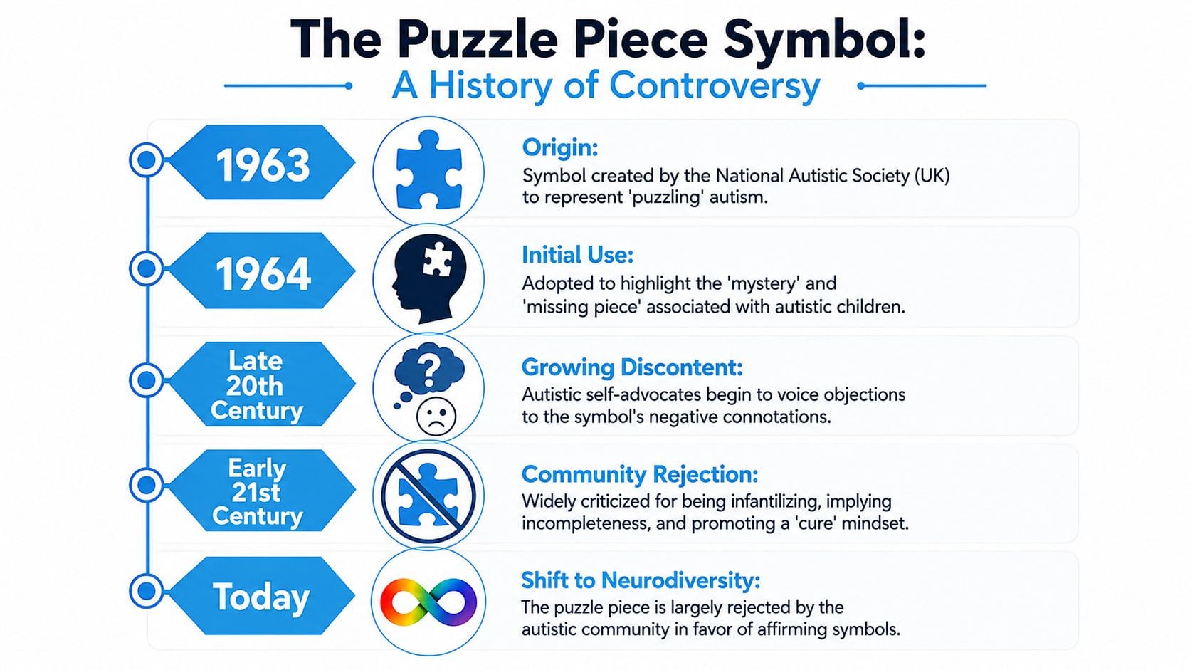
The symbol was first introduced by the National Autistic Society in the United Kingdom in 1963 to represent the complexity and “mystery” of the condition, originally implying that autistic individuals were “missing pieces” needing to be found, according to this history of autism symbols.
What the original design communicated
The early puzzle piece wasn't created by autistic people themselves. It came from a time when autism was often framed as baffling, tragic, or inaccessible. In that context, the puzzle image suggested that autistic people were difficult to understand, and possibly incomplete.
That may not be what a parent means when they wear or display it today. But symbols keep some of their old meaning, even when intentions change.
Here's why the symbol can feel painful to autistic adults:
- It can imply incompleteness. A puzzle piece suggests something missing.
- It can imply a problem to solve. Puzzles are meant to be figured out.
- It can feel infantilizing. The symbol has often been tied to child-focused messaging, even though autistic children grow into autistic adults.
- It can support a cure mindset. If someone is seen as a puzzle, the focus may shift toward fixing rather than understanding.
Why this matters for parents now
Many parents first encounter the puzzle piece long before they hear any criticism of it. That doesn't make them careless. It means they were given an older symbol without much context.
Choosing a different symbol isn't about guilt. It's about updating your language as your understanding grows.
This is especially important because children absorb the messages around them. If a child repeatedly sees autism represented as a missing piece, they may internalize the idea that something essential is absent in them. Even when adults don't say that out loud, the visual can still carry that message.
A more useful parent mindset
A helpful shift is moving from “How do I solve this?” to “How do I understand this child more fully?”
That change affects everyday caregiving. Instead of treating meltdowns, shutdowns, echolalia, or sensory avoidance like scattered puzzle clues, parents can treat them as meaningful forms of communication. A child's pattern is not a riddle to crack. It's a profile to learn.
That mindset also changes how you talk with teachers, relatives, and therapists. You're less likely to ask, “How do we remove this behavior?” and more likely to ask, “What need is this behavior expressing?” That's a very different kind of support.
The Rise of the Neurodiversity Infinity Symbol
The infinity symbol grew in popularity because many autistic people wanted a symbol that didn't frame them as broken. Instead of missing pieces, the infinity loop suggests complexity, variation, and possibility.
The rainbow-colored infinity symbol was introduced in 2005 as part of the neurodiversity movement and has become the preferred symbol within many autistic communities, representing that autism is a natural variation in human neurology rather than a deficiency, according to this overview of autism symbols and neurodiversity.

Why the infinity symbol feels different
The contrast with the puzzle piece is sharp.
A puzzle piece points to absence. An infinity loop points to continuity. A puzzle suggests a fixed answer. Infinity suggests a person whose needs, strengths, sensory profile, and communication style can't be reduced to one narrow template.
That's why many parents find the infinity symbol more aligned with acceptance. It doesn't deny support needs. It refuses to describe those needs as evidence of defect.
Some families also notice that the infinity symbol pairs better with identity-affirming language in practical settings. If you're filling out school forms, learning diagnostic language like the ICD 10 code for ASD, or talking with providers, it helps to separate administrative labels from personal identity. A billing or documentation code may be necessary. A child's self-concept needs something more humane.
Rainbow and gold meanings
The rainbow infinity symbol is often used to represent broader neurodiversity. It can include autism while also pointing to the full spectrum of neurological difference.
The gold infinity symbol is often used more specifically for autism. Many parents choose it because gold carries a message of worth rather than deficiency.
A quick visual explanation can help if you're sharing this with relatives or school staff:
What this symbol teaches parents
The infinity symbol can also reshape how you observe your child.
Instead of asking why your child doesn't respond like other children, you may start asking:
- What sensory conditions help them feel safe?
- Which routines lower stress?
- When do they communicate most clearly?
- What patterns show up before overwhelm?
A symbol can't support your child by itself. But it can steer adults toward a more respectful lens.
That is why many families move toward infinity imagery over time. The symbol itself is simple. The mindset behind it is much bigger.
Comparing Autism Symbols Head to Head
Sometimes the clearest way to think about symbols for autism is to compare them directly. The debate can sound abstract until you put the two most common symbols side by side.
One key reason many parents reconsider their choice is that autistic adults in self-advocacy surveys consistently rate the infinity loop as the preferred identifier with a 3-4x higher acceptance rate compared to the puzzle piece, directly influencing the visual standards adopted by major international organizations, as summarized in this cultural overview of autism representation.
Autism Symbol Comparison Puzzle Piece vs. Infinity Symbol
| Attribute | Puzzle Piece | Infinity Symbol (Rainbow/Gold) |
|---|---|---|
| Origin | Introduced in the UK in the 1960s during an era that framed autism as mysterious | Emerged from the neurodiversity movement |
| Core message | Autism as puzzling, hard to decode, or missing something | Autism as part of natural neurological diversity |
| Common emotional reaction | Can feel negative, deficit-based, or infantilizing to many autistic people | Often feels more affirming, identity-based, and respectful |
| What it suggests to the public | A condition that needs solving | A person with a broad range of traits, needs, and possibilities |
| Who tends to prefer it | More often parents and professionals in older awareness frameworks | More often autistic adults and self-advocates |
| Best fit for acceptance-focused families | Usually less aligned | Usually more aligned |
How to use this comparison in real life
If your child is very young, you may be making symbol choices before they can express a preference. In that situation, a simple rule helps: choose the symbol least likely to communicate that your child is broken.
If your child is older, ask them what feels right. They may like the infinity loop, prefer no symbol at all, or choose something more personal, like a favorite color or a sensory-friendly icon. Respecting that preference teaches self-advocacy.
You can also use this comparison when talking with schools or relatives. Instead of saying, “That symbol is bad,” try saying:
- “We're trying to use symbols that feel more acceptance-based.”
- “We prefer imagery that doesn't suggest our child is incomplete.”
- “We want our child to see autism represented in a positive way.”
A quick decision filter
Ask these three questions before using a symbol:
- Does it describe autism as a lack, or as a form of difference?
- Would an autistic adult likely feel respected by it?
- Does it match the way I want my child to understand themselves?
If the answer to the first question leans toward lack, that's a strong sign to reconsider.
Beyond the Main Symbols Colors and Icons
Once parents move past the puzzle piece versus infinity debate, a second layer appears. Colors and everyday icons matter too.
Many autistic advocates now prefer red and gold over blue, with gold specifically representing value, acceptance, and respect for autistic identities, reflecting a move away from deficit-focused messaging, according to this discussion of autism colors and symbols.
What different colors often communicate
Blue is still widely used in general awareness campaigns. For some families, it feels familiar. For others, it carries older messages that center autism as a problem to spotlight rather than a community to respect.
Gold often feels different because it suggests worth. Red is also used by advocates who want a stronger alternative to passive awareness messaging.
A simple way to think about it:
- Blue often signals traditional awareness branding.
- Gold often signals respect and value.
- Red often signals a push toward acceptance and autistic-led advocacy.
- Rainbow often signals diversity across neurotypes.
Icons used for daily support
Not every useful symbol is an identity symbol. Parents also use visual icons to support regulation, communication, and routines.
Examples include:
- Sensory icons for headphones, quiet space, snack, bathroom, or break
- Routine symbols for bedtime, school, therapy, and transitions
- Emotion visuals that help a child point to feelings without needing complex language
- Choice boards that reduce stress during demanding moments
These practical visuals matter because they shape a child's daily environment more than a T-shirt ever will.
Parent lens: The best visual support is the one your child understands quickly and experiences as safe.
If your child learns best through visuals, these visual learner strategies for neurodivergent children can help you think beyond identity symbols and toward communication tools that reduce friction at home.
Why this broader view helps
A family can choose a beautiful, affirming autism symbol and still use visual systems that feel confusing or overwhelming. That's why it helps to think in layers. Identity symbols communicate values. Functional icons support daily life.
When those two layers match, your child gets a more consistent message. “You are valued” and “your needs make sense” start to show up in the same environment.
How to Use Symbols in Daily Life and Communication
Once you've chosen more affirming symbols for autism, the next step is using them in ways that help your child. Many parents struggle with this stage. They understand the philosophy, but they want practical options.
That matters because research confirms that puzzle pieces are associated with imperfection and being “unsolved,” which can negatively impact how autistic students are perceived during AAC interventions, yet guidance rarely offers a practical toolkit for choosing better symbols, according to this research on symbol meaning and AAC perception.
Start with the spaces your child sees every day
Your first changes don't need to be public. Start at home, in school materials, and in care tools your child interacts with.
Use affirming symbols in places like:
- Communication binders with a rainbow or gold infinity cover icon
- Visual schedules that use neutral, concrete icons instead of deficit-focused branding
- Bedroom doors or calm-down corners with a preferred color and simple sensory symbols
- Backpack tags or lunch items that identify belongings without relying on stigmatizing imagery
If you're labeling lunch containers, water bottles, or sensory items for school, a practical guide to safe kid labels can help you choose everyday labeling options that hold up to real use.
Use symbols to support communication, not just identity
Symbols are especially important in AAC, visual schedules, first-then boards, and cue cards. In those tools, the goal is clarity and emotional safety.
Helpful options often include:
- Concrete action icons such as drink, stop, help, finished, or break.
- Body-based supports like quiet, squeeze, movement, bathroom, or snack.
- Emotion and regulation visuals that let a child indicate overload before a meltdown builds.
- Identity-affirming covers or headers that avoid framing autism as something missing.
If you're building simple printable supports, these ASD communication cards offer a useful starting point for thinking about what children can point to quickly under stress.
Use scripts for school and family conversations
You don't need a long lecture when you ask others to switch symbols. Short, calm language works better.
Try lines like these:
- To a teacher: “We're using the infinity symbol because it feels more acceptance-based.”
- To a grandparent: “A lot of autistic people don't like the puzzle piece, so we're trying to follow community preferences.”
- To a therapist or aide: “We want visuals that support communication without suggesting our child is incomplete.”
When adults align on respectful visuals, children get a steadier message about who they are.
Keep the child at the center
Some children will care strongly about the symbol. Some won't care at all. That's okay.
The point isn't to become perfect about imagery. The point is to make thoughtful choices that support dignity, reduce harmful assumptions, and fit your child's real communication style. If a symbol helps your child feel recognized, understood, or calmer, it's doing useful work.
Conclusion Choosing Acceptance and Understanding
The conversation about symbols for autism is really a conversation about values.
One path treats autism as a mystery, a lack, or a problem to solve. The other treats autism as a meaningful part of a person's identity, with real support needs and real strengths. That's why so many parents eventually shift from older awareness imagery toward symbols that autistic people themselves are more likely to welcome.
You don't have to get every choice right immediately. Most families learn this gradually. What matters is the direction of travel. If your choices move toward respect, listening, and identity-affirming support, you're on solid ground.
That same acceptance-based mindset will keep serving your child as they grow. A young child may need visual schedules and sensory cues. A teen may start wanting more say in how they identify publicly. An adult may care about community, friendship, or relationships, and spaces such as an autism dating site can become relevant later because belonging doesn't stop at childhood.
Your child is not a puzzle to finish. Your child is a whole person to understand.
The best symbol is the one that points adults in that direction.
If you want a practical way to turn acceptance into daily support, Guiding Growth helps you track patterns, routines, communication, sensory needs, meltdowns, sleep, diet, and care details in one place. Instead of guessing what your child needs, you can spot patterns, share insights with caregivers, and build support around who your child is.